Node appearance
There are three aspects of a node’s appearance that can be customised; the icon, background colour and its label.
Icon
The node’s icon is specified by the icon property in its definition.
The value of the property can be either a string or a function.
If the value is a string, that is used as the icon.
If the value is a function, it will get evaluated when the node is first loaded, or after it has been edited. The function is expected to return the value to use as the icon.
The function will be called both for nodes in the workspace, where this references a node instance, as well as
for the node’s entry in the palette. In this latter case, this will not refer to a particular node instance and
the function must return a valid value.
            ...
            icon: "file.png",
            ...
There are some stock icons available for use, or the node can provide its own.
Stock icons
Custom icon
A node can provide its own icon in a directory called icons alongside its .js
and .html files. These directories get added to the search path when the editor
looks for a given icon filename. Because of this, the icon filename must be unique.
The icon should be white on a transparent background, 20 x 30 in size.
Background Colour
The node background colour is one of the main ways to quickly distinguish different
node types. It is specified by the color property in the node definition.
...
color: "#a6bbcf",
...
We have used a muted palette of colours. New nodes should try to find a colour that fits with this palette.
Here are some of the commonly used colours:
- #3FADB5
- #87A980
- #A6BBCF
- #AAAA66
- #C0C0C0
- #C0DEED
- #C7E9C0
- #D7D7A0
- #D8BFD8
- #DAC4B4
- #DEB887
- #DEBD5C
- #E2D96E
- #E6E0F8
- #E7E7AE
- #E9967A
- #F3B567
- #FDD0A2
- #FDF0C2
- #FFAAAA
- #FFCC66
- #FFF0F0
- #FFFFFF
Labels
There are four label properties of a node; label, paletteLabel, outputLabel and inputLabel.
Node label
The label of a node in the workspace can either be a static piece of text, or
it can be set dynamically on a per-node basis according to the nodes properties.
The value of the property can be either a string or a function.
If the value is a string, that is used as the label.
If the value is a function, it will get evaluated when the node is first loaded, or after it has been edited. The function is expected to return the value to use as the label.
As mentioned in a previous section, there is a convention for nodes to have a
name property to help distinguish between them. The following example shows
how the label can be set to pick up the value of this property or default to
something sensible.
...
label: function() {
    return this.name||"lower-case";
},
...
Note that it is not possible to use credential properties in the label function.
Palette label
By default, the node’s type is used as its label within the palette. The
paletteLabel property can be used to override this.
As with label, this property can be either a string or a function. If it is a
function, it is evaluated once when the node is added to the palette.
Label style
The css style of the label can also be set dynamically, using the labelStyle
property. Currently, this property must identify the css class to apply. If
not specified, it will use the default node_label class. The only other
predefined class is node_label_italic.

The following example shows how labelStyle can be set to node_label_italic
if the name property has been set:
...
labelStyle: function() {
    return this.name?"node_label_italic":"";
},
...
Alignment
By default, the icon and label are left-aligned in the node. For nodes that sit
at the end of a flow, the convention is to right-align the content. This is done
by setting the align property in the node definition to right:
...
align: 'right',
...
Port labels
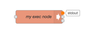
From Node-RED version 0.17 onwards nodes can optionally provide labels on their input and output ports, that can be seen by hovering the mouse over the port.

These can either be set statically by the node’s html file
...,
inputLabels: "parameter for input",
outputLabels: ["stdout","stderr","rc"],
...
or generated by a function, that is passed an index to indicate the output pin (starting from 0).
...,
outputLabels: function(index) {
    return "my port number "+index;
}
...
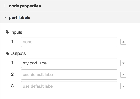
In both cases they can be overwritten by the user using the port labels section of the configuration editor.


Note: Labels are not generated dynamically, and cannot be set by msg properties.
 alert.png
 arrow-in.png
 bridge-dash.png
 bridge.png
 db.png
 debug.png
 envelope.png
 feed.png
 file.png
 function.png
 hash.png
 inject.png
 light.png
 serial.png
 template.png
 white-globe.png